ireally think logo’s are important if you think referrals are part of your business plan
one book i read said the potential customer has to register your presence 7 times ..
7 blips on his / her radar… after that they think they know you… and a positive referral registers something along the line of…. “oh yeah… i see his (trucks )…….
….(job signs )…. ( ads )……. (letterhead )….. everywhere”
if alll you have is a sign, with your name on it….that gets lost in the fog
but if your company name is on a yellow sign… they go… oh , yeah….that’s the guy with the “yellow sign “
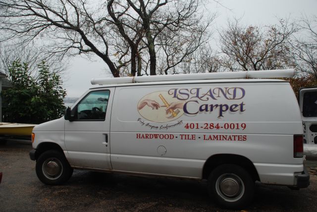
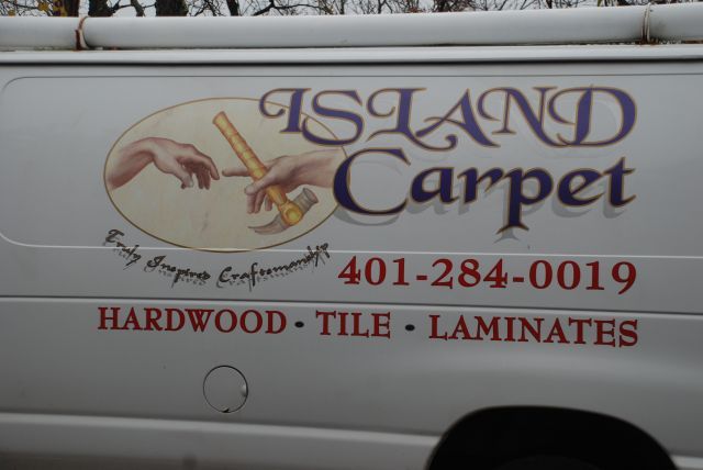
anyways…. got any favorite logos… here’s one that got me thinking about this again today…. my flooring guy…. Island Carpet
Mike Hussein Smith Rhode Island : Design / Build / Repair / Restore
Edited 11/7/2008 8:23 pm ET by MikeSmith
Edited 11/7/2008 8:24 pm ET by MikeSmith
Edited 11/7/2008 8:25 pm ET by MikeSmith


Replies
didn't like it until I saw the close up with the inspired sentence, now it makes sense. Whats yours? Or are you trying to put one together?
here's ours.... think i developed it after vthe guy with the "yellow signs" started eating my lunch in about '93
View Image
even from a distance too far to read the logo.... most still recognize it as us
View Image
Mike Hussein Smith Rhode Island : Design / Build / Repair / Restore
Edited 11/7/2008 8:49 pm ET by MikeSmith
Edited 11/7/2008 8:51 pm ET by MikeSmith
never understood the idea of legal stuff on the sign, rec and lic #. Is it a requirement?
In Westchester wher I used to live ( a county south of me) it is required on all advertising, signs and documents.
i see it as a plus.... we have a low number (373 )
and the Massachusetts Construction Supervisor is hard to come by
but , yes... the RI reg. # is supposed to be displayed in all ads
Mike Hussein Smith Rhode Island : Design / Build / Repair / Restore
Edited 11/7/2008 9:22 pm ET by MikeSmith
so are you rethinking the logo? wanting input?
no... i'm happy and contented and everyone ( ? ) in the state recognizes minei'm just doing my part to help guys / girls with another tool that can help them make their phone ringi know people say... .. "i saw you over in Narragansett yesterday"..... and i know they didn't see me... they saw Roy...or they'll say... "hey .. i saw one of your signs over in Portsmouth last week"the guy who goaded me into the logo had these stupid yellow signs.... just your basic 12 x 18 rectangle.. the print wa so small you couldn't read it unless you were standing on top of itbut no matter where i went all i could see were his little yellow sings... the shape and the color were all it took Mike Hussein Smith Rhode Island : Design / Build / Repair / Restore
Mike,
Is he still in business ?
yeah....... he's still at it.... changed his business plan after a lawyer took him over the hurdles for a couple hundred thouhe's very low key now... but he certainly had the tiger by the tail for a couple yearsMike Hussein Smith Rhode Island : Design / Build / Repair / Restore
while i'm out and about, i'll look for logos (tradespeople ) that catch my eyewhat do you have ?..... i'm always open to suggestions... good or badMike Hussein Smith Rhode Island : Design / Build / Repair / Restore
Still got this...
View ImageMade a few adjustments over the years, but basically the same.Spheramid Enterprises Architectural Woodworks
Repairs, Remodeling, Restorations
They kill Prophets, for Profits.
BRING BACK SPLINTY.
time to update that addy there, homey
hey...keep 'em commingyou logo pros could be a little more liberal in your critique...
as in ..
more critique.... less "nice work "or not.....
sometimes i'm conflictedMike Hussein Smith Rhode Island : Design / Build / Repair / Restore
Edited 11/8/2008 11:52 am ET by MikeSmith
Wonder who has that ph# now..LOL.
I lost the art work in the fire, so old cards is all I gots left.Spheramid Enterprises Architectural Woodworks
Repairs, Remodeling, Restorations
They kill Prophets, for Profits.
BRING BACK SPLINTY.
FWIW here's mine
I'm pretty sure I'm going to change back to a photo of me in the tux. Photo is on the door of all of our trucks.
Maybe still use this on the letterheads. I'm relatively infamous in the construction circles here.
apropos..... on the side of a dump truck i bet it conveys all the meaning you need
View ImageMike Hussein Smith Rhode Island : Design / Build / Repair / Restore
ok... thanks and a tip of the hat to Don..
View Image
and Island Carpet's version...
View Image
Mike Hussein Smith Rhode Island : Design / Build / Repair / Restore
Edited 11/8/2008 1:08 pm ET by MikeSmith
Sphere
I played with your artwork and I think it looks betterhere is blank version & business card version.
If you would like to have it I will burn it on a disc and be glad to send it to you
just e-mail me off line at [email protected] also if you want any copy changed let me know so I can put it in for you
Zeeya
View ImageView Image
View Image
Edited 11/8/2008 9:20 pm ET by ZEEYA
Cool!
I'll email the real address and number.
Thnx!Spheramid Enterprises Architectural Woodworks
Repairs, Remodeling, Restorations
They kill Prophets, for Profits.
BRING BACK SPLINTY.
Frank! I just got the package you sent! AWESOME man, thank you, thank you! The EXTRA included was really kind.
IOU 1 .Spheramid Enterprises Architectural Woodworks
Repairs, Remodeling, Restorations
They kill Prophets, for Profits.
Duane
You're welcome. No problem glad to do it. Don't know if you have Publisher but if you do you be able to print your own business cards the file is set up on the disc with the other images and you have the Avery # on the tear off part of the cards.
FrankView Image
I had PUB on my old '98 I think, but not on either XP. I've printed my cards ( that I have now, but totally differnt) on the same card stock, and even some other..so it'll do it with what I have.
I also have a real life paper cutter, if I don't use the pre-cut stock.
Thanks again..Spheramid Enterprises Architectural Woodworks
Repairs, Remodeling, Restorations
They kill Prophets, for Profits.
hey zeeya, my great buddy, how's it going. are you bored and have an itching to do some more computer graphic design? well, if your answer is yes, then here is the challenge, make a logo for my website, nothing to fancy, just a symbol maybe with the name "Cocobolo Boy", nothing else
m/ (>.<) m/http://www.cocoboloboy.co.nr
Edited 12/9/2008 3:27 pm ET by andyfew322
Hey birthday boy heres mine
View Image
Think this one gets remembered?
View Image
you betcha.... i'm not sure if it's good..... but it sure is memorableMike Hussein Smith Rhode Island : Design / Build / Repair / Restore
I'd say that's a pretty bad logo.
Not that a logo has to be GOOD to be recognizable. Often, a really bad logo can work as well as a really good logo...as long as it's unique enough o stick out in the crowd.
My gripe with the Island logo is that there's way too much going on, and they chose a horrific typeface for the tagline. Barely legible standing still in a close-up...I can't imagine being able to register what that says on a moving van.
I tend to agree with you on the busy-ness of that van's logo.
The listed occupation in your profile says maybe you design logos for a living???
C'mon, share.The best reward for a job well done is the opportunity to do another.
My degree is in art/graphic design, so yea, I've done a share of logos.These days I'm mainly a web developer wishing he was doing something outside instead... ;o)But yea, I've gotten a ton of great advice on home building in these great forums, so if I can help in any way with some logo advice, I'd be glad to.
when you said bad logo... i thought you meant mine !i'd agree with you on the "hard to read" part..
but i think he gets an "A" for unique & memorable....
and as you can see, i'm partial to the shape of his designi'll take a pic of his billhead so you can see that he's being consistent in his messageMike Hussein Smith Rhode Island : Design / Build / Repair / Restore
Mike,I still have not done anything with my logo... even contemplating a different name.Here is a simple logo I saw yesterday. The hands are sorta like Allstate.View Image
brian... i still like your logo.... but i think i would make it into a marker... like a stamp to sign your pieces.... or a branding iron....
but to me.... it is beautiful, but too mystical.... by itself it gives me this reaction...."huh ?"
now this one View Image
speaks... it says hands.... home....structure.. CASE......... pretty cool
Mike Hussein Smith Rhode Island : Design / Build / Repair / Restore
Edited 11/10/2008 5:55 pm ET by MikeSmith
The abstract tree graphic is supposed to evoke a mystical feeling... though it may not be ideal as a business logo, the origin is Celtic, it is the crann bethadh (krawn ba-huh), or Tree of LifeHere is part of the text from the link below:"With trees as far as the eye could see in Celtic lands, it is no wonder that they were such sacred symbols in all Celtic tribes.Trees provide sustenance for people and animals. They are a source of healing medicinal extracts. Their wood provides materials to build shelter as well as fires for preparing nourishing meals, warming the body on a frigid night, or engaging in spiritual rituals.The wood of many trees was also considered magical."http://www.fantasy-ireland.com/Celtic-tree-of-life.html
Working with wood can be a mystical experience... I like providing shelter and warmth with wood.
I was highly criticized by the designer of my logo for many of the same faults you pointed out. It's tempting to overly complicate a logo. In the end it feels better to be clean and concise. Ultimately, its the conversation the logo spurs where the details of the business should reveal themselves. Here's mine. Feel free to critique it.
Nice logo. The name is catchy and has a dual-meaning. The color and arrow remind me of the recycling bins we have here....same shade of blue. So as a renovating company you are "recycling" an existing house. Was that the intent ?
That's pretty much the message I was going for. The name also hinges on all the "re" words used in the types of projects we do. I am sure you can imagine all the terms: renovate, remodel, repair, etc.
785 area code is that Topeka?
yeah, Northeast KS too (except the KC area). I am from Manhattan.
Why do you ask?
Because I live the 913 area code, aka as Glitter Gulch you know Johnson County. Smart man to avoid the KC area.
But if you found Breaktime, you're good enough to work on my house :o)
Oh yeah I graduated form KState too......
Might be worth your while to put no Jayhawks on your logo too :o)
I like it. Simple. Clear. Explains the nature of your business and give contact info. Even has a little litteration in the wording. I like it a lot.
Thanks
I agree with a logo being important - but then, I used to design logos professionally. I guess everyone pretty well knows mine - since I use it on my tag line.
my first name was castle builders
View Image
not a logo, but a t-shirt design
View Image
my current logo
View Image
Here's mine. It's not terribly "professional", but it was cheap and conveys what I do (as best as I know how). I also like that it's sort of friendly-looking and gives the impression of a handyman type of contractor, which is what I am.
View Image
Was the 'CPR' intentional? If so, clever. If not, you need to capitalize on that!
Thanks. Yes, the CPR is intentional. The official name of my business is Don's CPR.
Why dont you incorporate the DonCanDo into your logo?
Why dont you incorporate the DonCanDo into your logo?
Thanks, that's a good idea. I just might do that one day.
Hey, how about "You can't do it, but Don can do it" :-)
here's my logo as a .jpg....
View Image
Mike Hussein Smith Rhode Island : Design / Build / Repair / Restore
Edited 11/8/2008 6:01 pm ET by MikeSmith
Interesting topic. As things slowed done this spring I decided to update my logo and the following is what i ended up with. The big one gets printed on the back of t-shirts and shows is a rendering of my truck and forklift as they definantly help us stand out.
You need collapsable saw horses..Spheramid Enterprises Architectural Woodworks
Repairs, Remodeling, Restorations
They kill Prophets, for Profits.
BRING BACK SPLINTY.
I don't know how well collapsable horses would hold a lift of 2x10, we carry 24 of our model with us from job to job and have another 10 or so at the barn that travel to the smaller jobs.
Thats why they call them Collapsable..LOL
I got a crew on my job just now, packed in 6 or eight sets like you have there..impressed me. It shows a level of knowledge that few recognize.Spheramid Enterprises Architectural Woodworks
Repairs, Remodeling, Restorations
They kill Prophets, for Profits.
BRING BACK SPLINTY.
good tee shirt.... chuck loves those..... send me one and ill pay you... we sew our MFSA patch on the left sleeve
View Image
gotta get brian in here... he's got a great tee shirt tooMike Hussein Smith Rhode Island : Design / Build / Repair / Restore
Cool logo.
And you are right on about the horses. I still like my hand made wood horses the best. Some of the guys poke at them.
Before you know it they won't let go of them.
Job we did last year I made them cut 4 of them up and toss them in the dumpster as the were over 10 years old. I had to YELL at them to get rid of 'em.
Thant's funny. I once made a bunch of cool sawhorses for the crew. First day out, my painter lost two. Said they blew off the truck. Later, he admitted he sold them to a neighbor who came by his job!View Image “Good work costs much more than poor imitation or factory product†– Charles GreeneCaliforniaRemodelingContractor.com
View Image
Four of these in good shape will hold a small car.
I had made six new at the start of a house. Cleaning off the job six months later I had 4 of them in the back of my Ranger on top of a load of cut offs.
When I got home there were only 3. Never figured out where the other one went.
Edited 11/8/2008 9:12 pm ET by EricPaulson
What's the "F" stand for? I bet Francis.Spheramid Enterprises Architectural Woodworks
Repairs, Remodeling, Restorations
They kill Prophets, for Profits.
BRING BACK SPLINTY.
you be wrong... it's fredericMike Hussein Smith Rhode Island : Design / Build / Repair / Restore
That was my next guess.Spheramid Enterprises Architectural Woodworks
Repairs, Remodeling, Restorations
They kill Prophets, for Profits.
BRING BACK SPLINTY.
here's my letterhead / invoice & business card
View Image
and the letterhead / invoice from Island Carpet
View Image
you can see that he has a very fine handwriting... so it wouldn't surprise me if he did his own artwork
Mike Hussein Smith Rhode Island : Design / Build / Repair / Restore
Edited 11/8/2008 7:42 pm ET by MikeSmith
Edited 11/8/2008 7:44 pm ET by MikeSmith
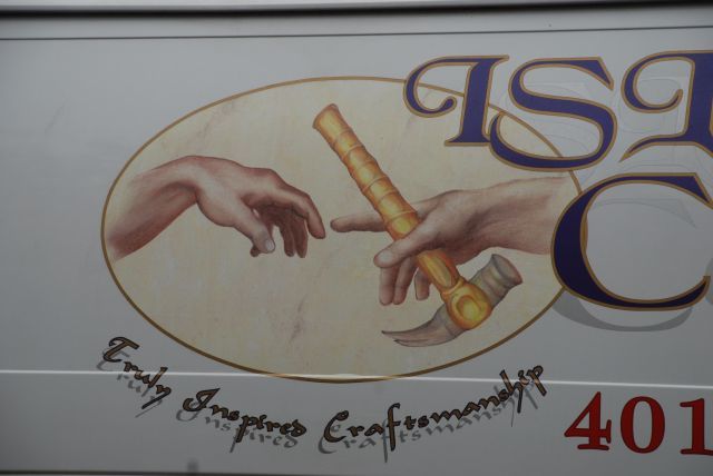
Those hands almost touching, that's a famous image from Michalangelo, isn't it?
Yupppp...PaulB
http://www.makeabettertomorrow.com
http://www.finecontracting.com
god, you're quick.... no flies on you !yeah... i axed him about that... he says he added the tack hammer as god giving him the tooli wonder how he got the inspiration to use those symbols ?Mike Hussein Smith Rhode Island : Design / Build / Repair / Restore
Those wrists look mighty weak.The entire logo seems kind of, well...Are these guys also interior designers ?;o)
can someone post the Cistine Chapel original along side his kock-off ?then we could make a JUDGEMENTMike Hussein Smith Rhode Island : Design / Build / Repair / Restore
Here you go.
But as you can see, I'm not taking any chances on getting banned :-)
View Image
That's just the Renaissance for ya. And the pants they wore. Yikes.
And I haven't even mentioned the hammer handle, yet...
Maybe I'm biased on this question, but of course logos are an important part of brand recognition.
Here's mine
View Image
Heyyy, I want that color on my Sphere!Spheramid Enterprises Architectural Woodworks
Repairs, Remodeling, Restorations
They kill Prophets, for Profits.
BRING BACK SPLINTY.
Funny, I was going to tell you we need to put some technicolor on that logo of yours.'Man who say it cannot be done should not interrupt man doing it' ~ Chinese proverb
View Image
My first draft was re-drew by a friend who previously worked at the Phila. Mint. He did the camera ready art. Then I went to get a Quickie Printer to copy the grey scale and make cards or new invoices or something, xxerox ing the old printing..he told me he couldn't get it to come out right.. He said " Damm, that grey scale is like MONEY, I can't get it" LOL
He was right, it never looked the same when photocopied or scanned, I need new art work..the first guy is long since dead.Spheramid Enterprises Architectural Woodworks
Repairs, Remodeling, Restorations
They kill Prophets, for Profits.
BRING BACK SPLINTY.
You don't need new art...you need a mint-quality engraving press to print your cards!
Edited 11/8/2008 11:01 am ET by darrel
Wonder if they rent me time on a the money press? LOLSpheramid Enterprises Architectural Woodworks
Repairs, Remodeling, Restorations
They kill Prophets, for Profits.
BRING BACK SPLINTY.
Mike
Here's my logo I've been working on I think it will be final version.
View Image
View Image
ahem.....
where to begin ?Mike Hussein Smith Rhode Island : Design / Build / Repair / Restore
Well, for starters, shouldn't a logo include at least some contact info? Maybe clearly state the nature of the business?
How about a better collection of tools? Those are the worst hammers ever made!
Henley
It's just artwork a rendering basic tools that HO's can relate to .
ZeeyaView Image
" shouldn't a logo include at least some contact info? Maybe clearly state the nature of the business?"
Jim
The full logo does I just didn't show it for the sake of sizing. info goes next to the image . I didn't realise I had to put it all in for the show & tell .View Image
A logo is a flag. An Identifier. A badge. It's sole purpose is to ID the product/company/service in an easily identifiable way. It's part of your company's overall branding. Branding includes your visual presentation, which would be the logo, stationery (b-cards, letterheads, invoices), livery (trucks), marketing materials (signs, brochures, web sites, commercials), and, most importantly, the reputation of your company.
so darrel...
are all of the flags you've seen in these posts working ?
some better than others ?
i like the use of the descriptor "flag"
to be effective , one should be able to tell one flag from another.... from a distance...
and in the eye of the beholder.... "oh..... that's the so-and-so company .... i'd recognise that "flag" from a block away..... ( well ok....from across the street, driving by in a car )Mike Hussein Smith Rhode Island : Design / Build / Repair / Restore
well, if anyone wants a critique, I'd be glad to chime in.In general, I'd say simpler is better. The more iconic it can be, the quicker it is to 'read' and the more versatile it can be in various media.Remember that a logo doesn't have to explain your company. The Apple logo is a great example of that. It's not a logo of a computer. Just an iconic apple. The nike isn't a shoe, just a swoosh. That said, there are times when a more literal approach makes a lot of sense. If you business is generated from yellow pages, yard signs, vehicle graphics, etc, then perhaps an approach where one does use construction imagery for their logo makes more sense.In general, the most common mistakes when creating your own logo would include:- having the logo do too much. A lot of amateur logos are really complex collages (most government offices succumb to this mistake typically due to design-by-committee where everyone gets to have their little pet image included)- letting cheesy computer effects trump concepts or legibility (drop shadows, glows, 3-d effects, fake gloss, etc.)- bad type. Type is a tool for a graphic designer like a fine hand saw is a tool for a carpenter. Good fonts cost money, and are worth it.- being inconsistent. No matter how great the logo, if it's not used consistently, it'll loose it's ability to become a strong identifier for your company. If you invest in a logo, use it and use it consistently across all your communications.- using off-the-shelf clip art. The problem is that others do the same, and you end up with a logo that will just confuse you with the competition rather than stand out.But, all that said, graphic design isn't a whole lot different than fine homebuilding in that there are rules, norms, and best practices, but all can be broken when justified by a skilled craftsperson, who will also add their own sense of style and artistic talent to the piece.
good post darrell.... lots of meat to chew on
i'd guess being "market specific" would be important too....
that competitor's yellow rectangular signs meant nothing outside of our town...
but in this town ...that yellow rectangular sign....wether you could read the words or not.... meant "ah.....there he is again "Mike Hussein Smith Rhode Island : Design / Build / Repair / Restore
I've had two different biz identities in 15 years. I was Meetinghouse Restoration for most of that time, but have been Steve Zerby Design/Build for the last couple. Attached is letterhead and bizcard for both. The letter M as symbolic house was my logo as Meetinghouse Restoration, and I had that on my first truck, but that was three trucks ago. I've not created a logo for SZDB. I don't advertise and don't have signs on my truck and am booked up for two years, so see no need to. That's been my experience in this rural outback. If you are good, you are busy. If I was in a metro area I would get more serious about marketing.Steve
good letterhead...
View ImageMike Hussein Smith Rhode Island : Design / Build / Repair / Restore
I like the typography and the slogan, but have had trouble trying to think of a logo. The power of a good logo is undeniable.
Can you believe both of these are the same company?
View ImageView Image
View Image
CHALET SERVICE Cie
Dinosaur
How now, Mighty Sauron, that thou art not broughtlow by this? For thine evil pales before that whichfoolish men call Justice....
TH..... now that the election is over, its safe for the canuckians to come out of the woods !
ok... what makes your chalet logo discernable from the hundreds of other chalet logos ?
View ImageMike Hussein Smith Rhode Island : Design / Build / Repair / Restore
Must be the 8 X 8's he's using for all the framing. Looks kinda heavy to me.....
Hah. You think the elections are over...? I wish! Jean Charest (our provincial premier) just called an election for December. Yet another minority government leader hoping/praying he can pull a majority outta his hat. Arrrgggghhhh....
View Image CHALET SERVICE Cie.
So, what makes my logo stand out from the others?
The way it's used, primarily. I use it on every piece of paper (and every piece of 'virtual' electronic paper) I put out. It's the primary graphic element that tells someone what they're looking at before they get close enough to start reading it.
The graphic itself says 'building' or 'construction' by depicting an unfinished house frame. That's a universally recognised symbol. It also says 'strong' and 'reliable' by using simple, bold lines and shapes.
The typeface I chose for the company name (Stencil) echoes those ideas and reinforces the graphic. The letters in that face are framework letters, and they are bold and simple and easy to read.
I use the logo elements in ads and on my paperwork to draw the eye to where I want it to look. That's part of a logo's job. On ad flyers, the shack is right next to the phone number; on e-mail messages and bills and estimates it's right at the top of the message where it will say "You know me!" as soon as the message opens. On business cards--which I leave in racks in stores all over town (one of my best sources of new clients)--that logo takes up almost half of the entire card face...so it can be seen while the potential client is still 8 feet from the rack. On my website, it's right at the top of every page.
The other part of a logo's job is to create instant recognition by presenting a visual idea that can be absorbed in a single 'gestalt'. A logo should not try to communicate too much information; it should seek to create an impression. Impressions are remembered long after detailed data are forgotten.
Dinosaur
How now, Mighty Sauron, that thou art not broughtlow by this? For thine evil pales before that whichfoolish men call Justice....
Edited 11/9/2008 12:28 am ET by Dinosaur
ok...got it.... another good primer on logos and their useMike Hussein Smith Rhode Island : Design / Build / Repair / Restore
I'd be inclined to do something like this so you get your text in the foundation.
It's the quick and dirty version; it can be cleaned up.
View Image'Man who say it cannot be done should not interrupt man doing it' ~ Chinese proverb
View Image
LOL. Great minds think alike.
I'd already created a version of the logo with the name in the foundation--a couple of years ago, actually--but I lack the graphics software to do it the way I really want to. It woulda been so simple when I had my graphics studio: cut and paste (with a knife!) and shoot a velox with 8 or 10 different sizes on it.
Sigh; them were the good old days....
I've got Adobe Photoshop lying around here somewhere, but I figure that before I spend a year learning that one, I'd be better off learning to run the 90% of ACAD and 70% of Dreamweaver that are currently deep, dark, mysteries to me. Gotta set priorities in this techno-life....
Dinosaur
How now, Mighty Sauron, that thou art not broughtlow by this? For thine evil pales before that whichfoolish men call Justice....
We're both dinosaurs, I rememer Letra-Set and LeRoy pens.
Easy as pie. Make photostats on mylar and vellum. Even had an electric eraser!Spheramid Enterprises Architectural Woodworks
Repairs, Remodeling, Restorations
They kill Prophets, for Profits.
BRING BACK SPLINTY.
How about when "cut and paste" meant x-acto knife and hot wax? View Image “Good work costs much more than poor imitation or factory product†– Charles GreeneCaliforniaRemodelingContractor.com
Paste is what I got caught eating in the closet with Lil Suzy, in first grade.Spheramid Enterprises Architectural Woodworks
Repairs, Remodeling, Restorations
They kill Prophets, for Profits.
BRING BACK SPLINTY.
at least it tasted like paste at the time !:)
I rememer Letra-Set and LeRoy pens.
I still have some Letraset and Chartpak sheets around here somewhere...ouch! Damn! (Oh, yeah, that's what's in that yellow box under the desk that I keep stubbing my big toe on....)
I used Rapidographs, mostly. Had the ultrasonic cleaner around to get the dried ink outta those teeensy-tiny capillary tubes, too (still have it, and the pen set, from 6x0 up to No. 4, is sitting on my drawing table in it's --dry-- humidifier case). Sometimes I think I spent more time cleaning the damned things than actually drawing with them. But oh, what a clean line they would produce once you got 'em flowing.
Pads and pads of vellum, acetate, ruby-lith, 'comp' tissue, and even a few sheets of Bainbridge board sitting in the closet buried under other stuff I haven't used in years. And the Pantone markers, 240 of 'em in both chisel-tip and fine-point. Some of 'em actually still write....
Dinosaur
How now, Mighty Sauron, that thou art not broughtlow by this? For thine evil pales before that whichfoolish men call Justice....
this is the logo we use.
On the truck, we have the number below it. The trucks are white.
This pic is off the can cooler which has a bit more info on it.
Back of trailer is same as can cooler and sides of trailer just have the top part
I have gotten three jobs based on people knowing the name and the professional appearance. We are loaded down with guys that are just a ladder and a truck. I think it sets me apart. I am the small guy with the logod trucks around here.
Do you give out anyhting to customers? We always to forget to pick up the company post-its after a meeting at the customers house. We also give out shirts if they ask, and always tossing out these cheap can coolers. I think it helps to do this, do you?October 17th, 2009
Jeremy and Lisa
Was there ever any doubt?
I know you didn't ask for any advice but sometimes people need to be told the truth, regardless of any hurt feelings.
That logo is terrible. It looks amateurish and breaks many of the rules on the site that seeyou posted (http://www.tannersite.com/rules-of-logo-design/ ).
If you're serious about having a logo, you should probably get it designed by a professional. You local graphic design community college may offer design services by its students.
I don't have a logo myself but I'm smart enough to realize that graphic design is not one of my stengths and that i would need to outsource.
Chucky
You're right I didn't ask for advice nor were my feelings hurt. We are all entitled to an opinion . What we were all asked was"got a logo" I do so I posted it . nothing more wanted or needed from posting it. You don't have one and that's fine by me. I do and that's also fine by me.
I've used it for the last five years and it works for me so why should anyone say I shouldn't use it or or I'm an amatuer and I should hire someone to do it or I can't use it because some guy wrote 45 rules that work for him but not for me.
You tell your designer to make sure he uses all the rules for yours and you'll probably be waiting a heck of a long time or maybe not but either way it's always your choice in the end not his and even if as you suggest all 45 rules were used we will all still have an opinion on whether or not we like it but you know what "IT WORKS FOR YOU" and in the end that's all that counts.
Zeeya
View ImageI guess these guys didn't read the rules so there probably in big trouble and will go bankrupt according to you .But I don't think so their net income for 2007 was $645,000,000 (sixhundredfourtyfive million) dollars not too bad for using a bunch of colors in the logo "and broke rule #1 don't use more then 3 colors" but guess what "IT WORKS FOR THEM" and that's all that counts like it or not View Image
Sorry to get in on this so late. My home computer didn't have the logo and then I couldn't find the damn thing on my work computer!
When we changed our business name my son worked with the local sign shop to do this logo. We changed everything in a week. Before we had just script on the door of the trucks. Once the logo's were in place people we have known for years started saying "man, you guys must be busy, I see your trucks everywhere!" or new clients would say "We see your trucks everywhere, you must do a lot of work!".
The reality is we weren't doing anymore work after the logo change vs before. It was just that people noticed it. My son was the driver behind that change. It sure proved to me to that it was a good idea. DanT
yes.. i get that a lot...." we see your signs everywheer"ok.... but it's just 2 trucks and 3 guysMike Hussein Smith Rhode Island : Design / Build / Repair / Restore
An interesting tidbit on why sign shops maybe aren't the best places to get a logo created:http://www.vimeo.com/1465284
Edited 11/11/2008 6:29 pm ET by darrel
So you don't like the logo? Color? Size? Phone number? DanT
Oh, your logo is fine. Not the best out there, but there are definitely worse, and if it does the job, that's all that really matters.Just, in general, sign shops aren't design firms. They're out to sell signs, not make them look nice. ;o)
That was funny. I love people who are passionate about what they do. What a lot of people don't understand about really talented people is that their sensitivity is heightened, so their reaction seems disproportionate.
And really, most people don't care, don't want to hear it. I mean why didn't Van Gogh sell any paintings in his lifetime? No one cared what he was doing. He knew the value of what he was creating, but no one else did, save for maybe Theo. It was different. It wasn't recognized by the academy. There was no market for it. Van Gogh couldn't walk away from it, but he couldn't support himself by it either, so he was a failure, a loser, a fool. Yet today why do people pay millions for his work?
I can't imagine many people who post a logo on here would want to hear what a graphic designer like your video buddy (who's probably a really talented artist/designer) would say about it! =)
What do you think someone like Beethoven would say if he could listen to some contemporary rap music? I have fun just thinking about it sometimes. But those rappers make big bucks.
When clip-art became the rage, I left the graphics field. But I guess the remodeling/building industry faces the same brick wall of ignorance, hence the proliferation of McMansions and tract hacks. But what do I know?View Image “Good work costs much more than poor imitation or factory product†– Charles GreeneCaliforniaRemodelingContractor.com
In all creative fields (and I call Fine Homebuilding a creative field as well) there is the spread of 'Generica'.So, yes, I totally agree. There was a time (mid century) where style was pervasive and was definable as very 'American'. Arts And Crafts/Prairie Style architecture, Ford/GM/Chrysler autos, American Advertising, etc.Alas, we've sort of lost that style. We now have Wal-Marts, McMansions, motels with ugly signs, and lots of clip art. ;o)We've replaced 'style' with 'cheap' in many parts of our lives."Progress", I guess. ;)
I get that the guy can complain.Other than that, what's the point of that video?
Jon Blakemore RappahannockINC.com Fredericksburg, VA
Entertainment?
He was entertaining.
I think you could do a segment on NPR's This American Life recounting his decision and journey to purchase the sign.
Jon Blakemore RappahannockINC.com Fredericksburg, VA
Sharp, Dan. I'm guessing on white trucks?
Yep, here is a shot of one of our trucks with it on it. Another is on a sign above our show trailer at a home show.
The car started as a joke. My step daughter is a branch manager for a local bank. When she bought her new car I told her I was glad she got it in white and I would get on my sign people to get it lettered for her since she drives around a lot on bank business. We laughed.
A month or so later I had two new magnetics made up for my dump trailer. I was driving by the bank and remembered that her and her mom were having dinner that evening so I quietly went into the bank parking lot and put the signs on the car, taking time for the pictures of course.
I then called her mom and told her to get the signs back at dinner. We laughed about it. She shows up for dinner and told her mom what I had done and that she found it when she went for her appointments. Then She handed Candy the sign back. Candy asked "where is the other one?" Laurie said " I just took this one off the drivers door!". So I got a days worth of free advertising as she went on all her appointment with my sign on the passenger door lol. DanT
Edited 11/12/2008 9:44 am ET by DanT
When I started I needed a card and logo quickly.
I went online and searched for 'water' symbols. My family name is 'Waters' and my fathers a painting business was simply 'Waters Painting.'
I found this symbol, a 16th century alchemic symbol for 'Water.'
Easy enough and people like it.
I'm going to do some hats and t-shirts soon, more for fun, but given all of my work has come from word of mouth and client referral, the more to go on the better.
Cheers,
Pat
I'd always caution about 'finding a symbol online', but that's an excellent logo you got there.
Thats a common one for the Zodiac "Water Bearer" Aquarius.
Hey, Zodiac...Jacques Cousteu had them, in the water..coincidence? I think not. lolSpheramid Enterprises Architectural Woodworks
Repairs, Remodeling, Restorations
They kill Prophets, for Profits.
BRING BACK SPLINTY.
I should have clarified the concern. Just remember that most things on the internet, like anywhere, are going to be copyrighted by someone. While a symbol can be generic, a particular rendering of it may very well be copyrighted. I'm not saying that's the case here, just one of those 'in general' heads ups.
i like it ..... looks like it could be recognized from across the street in a fast moving car
View ImageMike Hussein Smith Rhode Island : Design / Build / Repair / Restore
Apply Logo anywhere you see fit.... ;>)
Bill
Post my companies this time
Picture's not the best, but this is on our vans and other marketing material. Get a lot of double looks
View Image
it's a headturner allrighttook me awhile to find the name of the company... but it did get my attentionMike Hussein Smith Rhode Island : Design / Build / Repair / Restore
<took me awhile to find the name of the company.>Because you are drawn to the picture first?the name and info is on both passenger doors and the rear doorsimilar graphics on the website and business cardsalso emblazoned on the side of 2 emergency trailers
Barry E-Remodeler
as long as no one quits or gets fired you are good to go
;-)
I'm not on this truck because I began working here after they started doing these graphics. I am on a couple of the newer trucks. When anyone joins this company part of the work agreement we sign says that they may use our image after we leave. A few of the guys on this truck have left and been replaced.As they buy new trucks the graphics get updated
Barry E-Remodeler
Our logo:
View Image
View Image
Jerrald,Is that on your truck? or where do you use it?It reminds me of the old blueprints
Barry E-Remodeler
Barry it's not on the company truck now but will be on the new one when we make the move to get a Sprinter this winter. We're also taking about using the icongraphy on magnetic signs for the doors and tails of the personal vehicles but right now that's just in the talking about it stage. Is is on all our documents, some old T and polo shirts but it's time for new stuff and were planning on that with our new marketing push for 2009. I designed those icons thirteen years ago and while they've been tweaked a little and the metal work one was added about five years ago they have served us well. It is a blue print look and feel that people seem to recognize and identify with.
View Image
Mike, I just happened to stumble across this site:
http://www.tannersite.com/rules-of-logo-design/
and here's my new logo designed by FatRoman:
View Image
Damm, I got most of that, maybe missed on 3or4, but the last one is the killer..LOLSpheramid Enterprises Architectural Woodworks
Repairs, Remodeling, Restorations
They kill Prophets, for Profits.
BRING BACK SPLINTY.
BTW, yours is great, but it gets me confused with the FHB ad between posts sometimes.Spheramid Enterprises Architectural Woodworks
Repairs, Remodeling, Restorations
They kill Prophets, for Profits.
BRING BACK SPLINTY.
those are great rules... everyone creating a logo should refer to them again and againMike Hussein Smith Rhode Island : Design / Build / Repair / Restore
I just happened to stumble across this site:
http://www.tannersite.com/rules-of-logo-design/
Those are good rules; the only one I'd quibble with is #9 'never use clip art under any circumstances' or words to that effect.
There is an amazing variety of clip art available, and the professional stuff is often of excellent quality and variety. (It also carries a hefty price tag.) OTOH, the junk that comes 'free' with every Windoze OS isn't worth much, except maybe for a mommy making an announcement about her darling baby's first dry night outta diapers....
But more important, a good piece of clip art can be used as the starting point to develop one's own graphic. My 'house frame' logo started life as a piece of clip-art from 'Publisher', a design and web-creation program put out by Microsoft that sold for a fair amount of dough. The clip-art library in that program was substantial, and, while nowhere near the best I've seen, it is orders of magnitude better than the crud MS supplies with every OS they install in new 'puters.
The logo I now use is a modified version of the original piece of clip art. I've changed the aspect ratio, the weight of some lines, blew it up to 8000% and smoothed the pixel-jags in the edges one friggin' pixel at a time, and other boring stuff like that.
BTW, inherent in the concept of commercial clip art is permission to use it; that's what a designer is really paying for when he subscribes to a clip-art service. The only restriction on re-use is that you may not copy it and resell it as clip art. But you can plonk it into any commercial document you like and make a bazillion copies. That's what it's for, after all.
Dinosaur
How now, Mighty Sauron, that thou art not broughtlow by this? For thine evil pales before that whichfoolish men call Justice....
We developed this a few years back. Business couldn't be better.
Constructing in metric...
every inch of the way.
Holy hammer I think your logo art is good but I think the tag line in it is just brilliant.
View Image
Thanks Jerrald, We have a rack card we give to real estate agents that says, "Many things can go wrong at a closing and a hundred things can go wrong with a house. Real Estate Repairs gives you a hundred less things to worry about."Constructing in metric...
every inch of the way.
Here's my business card, logo image from Mimbreno, ancient New Mexico area artisans: View Image
Three of my favorite logos of all time:
View Image
View Image
View Image
How about a rap jingle.
Start up with the beat.
I'm Mike Hoo-SAY-in, you know I'm SAY-in . . . (drum and cymbal sounds done with mouth on mic . . . )
Grab crotch. Make a fist jab. Roll your eyes.
View Image
"A stripe is just as real as a dadgummed flower."
Gene Davis 1920-1985
<<<< 112588.137 in reply to 112588.1
How about a rap jingle. Start up with the beat.I'm Mike Hoo-SAY-in, you know I'm SAY-in . . . (drum and cymbal sounds done with mouth on mic . . . )Grab crotch. Make a fist jab. Roll your eyes.>>>>no, gene.... jingles are a different threadMike Hussein Smith Rhode Island : Design / Build / Repair / Restore
Hmm, no pictures. I'll work on it! DanT
Well, I think I got it this time. Sorry for the delay! DanT
tell Laurie it looks great on her car
View Image
and no more pictures of snow scenes , pleaseMike Hussein Smith Rhode Island : Design / Build / Repair / Restore
Here's mine...
View Image
It's only on my website, so the phone, location, etc. is not needed in the graphic.
See my work at TedsCarpentry.com
Buy Cheap Tools! BuildersTools.net
nice website - I like your work!View Image “Good work costs much more than poor imitation or factory product†– Charles GreeneCaliforniaRemodelingContractor.com
Thanks Huck, but your site is better. And that tool truck is awesome! =]See my work at TedsCarpentry.comBuy Cheap Tools! BuildersTools.net
Here's mine. It doesn't tie into the remodeling like a hammer and framing square might, but it gets noticed and I think reinforces the unusual business name.
Geez, another Minnesotan! Is that White Bear Lake area?Steve
Yeah, I think there are a fair number of us Minnesotans on here. I'm in St. Paul, but people ask me that all the time. One of the downsides to "Waterbear" living close to White Bear I guess.
I worked for Steve Madole's company "Architrave Remodeling" in St. Paul for a little while. He mostly did stuff around the Selby-Dale/ Summit Ave area. And in the mid 80's I lived on Lincoln Ave, just off Grand, not too far from Dale. I like St. Paul a lot, and if I were to move back would probably live over there somewhere, despite having grown up in Minneapolis.Steve
Nice bear!
Thanks, I had a friend who dabbles in design take the outline from a piece of carved stone I picked up in Montana, then he worked up some options for colors and font for me. I'm really happy with it.
Here's our logo. We've used it on all sorts of stuff from vehicles to website to letterhead.
I don't know how to get the picture into the text like you do!
About the only change we've made over the years is to make the lines a bit heavier.
ALL: Open to suggestions!
just like this....
View Image
right click on the image... choose "copy"
then edit and "paste"Mike Hussein Smith Rhode Island : Design / Build / Repair / Restore
That's what I was trying. When I click on edit, "paste" is not highlighted and can't be chosen. Maybe it's because I use Mozilla as browser.
On my truck,hats,shirts,business cards,coats,basically everywhere!:)
Nice design, but I think the name is what stands out. Your last name, I assume? Anyway, I like it - short, easy to remember, grabs their attention. It's these little things that make the difference between who's working and who's looking for work. Hope it's keeping you busy.
Edit: "Your last name, I assume?" I guess I should look at the username when posting a reply. =)
See my work at TedsCarpentry.comBuy Cheap Tools! BuildersTools.net
If you haven't already done so, please update your profile. Since many issues are dependant on the region in which you work, we often look at your profile to see where you are writing from.
Edited 12/9/2008 1:15 am by Ted W.
Been meaning to get this in there - says "DESIGN, INC." now -
View Image
Forrest
Edited 12/9/2008 5:17 am ET by McDesign
Oh - I just whipped up this one up in AutoCAD for my work email signature line - (can't see the Forrest for the trees)
View Image
Forrest
Edited 12/9/2008 3:03 pm ET by McDesign
what's the geneology of your name ?
how cum u got 2 "R's" ?
inquiring minds, etcMike Hussein Smith Rhode Island : Design / Build / Repair / Restore
Not sure - my folks just liked it. I promise it's not from Nathan Bedford Forrest, no matter what FatRoman says.
Forrest
LOL. No no, I'd never suggest that.By the way, you guys coming up this way for Christmas?'Man who say it cannot be done should not interrupt man doing it' ~ Chinese proverb
View Image
I think DW and the kids are coming up the week after Christmas - I'll stay and work and do secret things to the house.
Forrest
you probably don't want to spell come the way you did :)this is mine for my website, it is temporary
m/ (>.<) m/http://www.cocoboloboy.co.nr